
Overview
The Context
Hexpert is a responsive web application that allows users to contact experts in computer building, and other areas related to computers. Users can search for and message experts related to the information they need, and if both user and expert agree to talk, they can schedule a video call to discuss in more detail.
I chose this project, as part of a User Experience (UX) Immersion Course with CareerFoundry, because I was researching computer building, while planning to build my own, and I noticed how difficult it was to find answers to specific questions about computer components and compatibility without multiple resources contradicting each other.
The Process
The goal of this project was to complete a polished design for a responsive web application, according to a pre-approved brief, to simulate the UX design experience of a working designer.
As this was part of a UX bootcamp, and I was basically completely new to the field, the process involved applying new knowledge to the project as it was learned. This was great for me, as I like practical application in all things, but it also lead to redesigning elements often. While this made me appreciate quick iteration, and influenced me to become less tied down to a particular idea or feature, it did also mean that there were times I had to completely redesign whole features in order to apply new information, which was frustrating at times.
The Results
The results were all elements of User Experience (UX) and User Interface (UI) design for the project, including extensive wireframes, mock-ups and prototypes which were used to create a final clickable prototype, as well as style guides and a design language system.
My Contribution
I was the sole UX/UI designer for the entire project, and therefore handled all areas of the project.
I consulted with a tutor and mentor through my course provider, who gave advice about direction and best practices, but, ultimately, I had final say in all design decisions.
The Project
As part of my UX Immersion Course with CareerFoundry, I was given a choice of four briefs to make my main project. The one that stood out to me was the Expert app:
Objective
Enable anyone, anywhere to instantly chat with an expert in virtually any field.
At first, this seemed like a pretty big workload for my first project as a solo designer, but my tutor gave me some great advice: “Facebook didn’t start as the global, multi-service company it is now. It started as a small social platform for a specific class in a specific college which could only be accessed with a password”. The point being that many products start with a smaller audience and service before developing and growing larger, so I should try to define the project around a more specific audience, and a theme that interests me, rather than going big from the start. It is a lot easier to keep engaged with something you are passionate about!
With my own experience of learning about computers, I decided to focus on creating a platform for users to find experts in computer building, and set to defining my project:
Objective
Enable anyone, anywhere to instantly chat with an expert in personal computers.
Context
We all need the advice of an expert sometimes, and how-to videos don’t always cut it. The goal of this app is to give people a simple, intuitive way to connect with an expert in building personal computers within seconds so they can feel more informed and more prepared to build or buy their own computer.
Whether you need component compatibility, a question answered about software requirements, or have a problem with finding the parts you need, you can get your answer here. The app allows you to pose a question to any expert and, if they feel they are the best to answer it, they can schedule a short video session for you to ask away!
The app will be free to use, but will require payment for any video calls done over the platform.
After deciding the project’s direction, I quickly researched information around computer building, that is what type of people build their own computers, the major players in this area and resources available to people who want to build their own computer. My findings were as follows:
Computers are Popular
As business and social interactions have moved further towards online spaces, and advances in technology increase exponentially, more people are purchasing personal computers than ever before. Due to the global pandemic, many people were or are working remotely from home, or simply spending more time at home, which encouraged some people to invest in their home computer set-up.
Building Computers Can Be Cost-Effective
Many retailers or consumer electronics brands produce “pre-built” computers, that is computers where all of the individual components are assembled and boxed together allowing a user to simply plug it in and turn it on (such as the average desktop computer, or the laptop you might be viewing this on!). These companies are generally trying to hit certain price points in order to draw in customers, which can mean by using some parts they will have to skimp on others, or they use patented or inefficient build methods which can result in people being unable to upgrade their computer in the future without dealing directly with the initial company, or even upgrade at all.
Building their own computer can reduce the cost for the user, versus a similar pre-built offering from a retailer, as the user takes on the labour cost as well as being able to look for deals, second hand parts, or choose parts that specifically support the user's software requirements without including unnecessary performance power. They can also future proof their computer by buying parts they know are compatible with their future plans, or buy cheaper versions of less important parts now until they have the money to upgrade them.
One caveat is that, also due to the pandemic, the price of key components has risen dramatically so finding parts at a reasonable price is difficult.
Gamers Build Computers
Building computers is generally a hobbyist undertaking for those interested in the process and who need a computer with specific requirements not met fully by pre-built offerings. The two main demographics that build computers are gamers and designers/developers/content-creators. Gamers is a colloquialisation for people who have a passion and interests for games, usually specifically video games.
Designers, developers, content-creators and gamers all require computers that have advanced components which can handle the computing power necessary for specific software, such as for rendering high-quality video files for editing, or high-quality images in a modern video game. While designers and developers are catered to specifically with pre-built computers that are designed around using popular industry standard software, such as Apple’s Mac Pro, they also usually receive company computers to operate from, therefore a personal computer is usually for freelancing or personal use.
Gamers are more likely to build computers as video games have different requirements and use separate game engines which interact with hardware inconsistently. As technology develops, and games get more technically advanced, computer parts may need to be updated, so often gamers build their own computers so that they can replace individual parts as needed rather than replace the entire computer as would be necessary with some (but not all) pre-builts.
This is not only clear from the general information available around building computers, but also from the marketing of the main brands within the consumer computer space. AMD, Intel and Nvidia are the most important companies in the consumer space as they produce almost all of the most important computer parts between them, that being GPUs (Graphics Processing Units), CPUs (Central Processing Units) and chipsets for the motherboards among other things. They manufacture these core components for almost every area of the industry from smartphones to consoles to computers.
Their marketing for consumer grade parts is consistently aimed at the gamer audience, a generally masculine dominated space, using darker colour palettes with bold vibrant colours in their content and for the designs of their physical products. The exceptions to this being Intel, which is largely aimed at the designer user base, and has been the CPU of choice for designers, developers and the Apple brand in general up until recently, and has a softer white and blue pallet except with some of their products which are aimed at the consumer hobbyist market where they adopt a slightly darker pallet.
My Process
(Initial) Problem Statement
People inexperienced in building or upgrading computers need a way to get accurate information about computer parts and their compatibility/quality because they want to build/upgrade their own computer but hardware is diverse and some resources online can be contradictory or inaccurate.
After conducting user interviews I revisited this problem statement as there was a slight change in focus.
To understand the current options available to people with this problem, I conducted an in-depth analysis of two web applications: TheOne and PCpartpicker. Here is a high-level summary of my findings:
TheOne
I chose this app because it was closest to the initial premise for this project, it is an app for conecting “experts” with users who want to learn a variety of skills or information from them, with a focus on health and wellness but including mathematics and other other types of skills.
I noticed that the app had multiple pain points, from inconsistent UI patterns to the overall theme of the web app version which felt like a magazine website rather than an app.
One stand out frustration was being unable to search a term directly, instead being forced to choose a generated result in the drop down of the search bar.
PCPartpicker
I chose this app because it is a popular tool for cross-checking computer parts prices across a variety of platforms, as well as incorporating some features to check compatibility of parts. It relates to my project in its results, as it provides a service that allows people who build computer to find information on parts across a variety of factors, is highly regarded and has a dedicated community surrounding it.
This app is well designed, with a robust search engine and algorithm, supplementary materials which add to the core feature of the app, and a community forum well-moderated to foster professional discussions.
It does not have any second-hand parts information, as it integrates with marketplace catalogues, and its features for checking compatibility are not consistent with all parts available.
User Interviews & Surveys
I conducted moderated remote user interviews and I created a survey to gather more data on the topic from a larger audience, while also using it for recruiting interview participants by including an email for interested people to use to contact me. I was unable to generate new participants via the surveys for these user interviews, so I relied on friends and acquaintances who fit my target audience.
Here are some key points from this testing:
Trust
People are less inclined, especially online, to use video chat features when there are text-based alternatives available, unless they feel comfortable or confident with the other person. Then, people generally prefer a video or audio chat to communicate important or detailed explanations as questions can be asked and responded to in real time.
Value
People who want to build their own computer are looking for value, whether that is from getting the best they can with a specific budget or from creating an alternative to a marked up pre-made retail product. People also want value from their time. They do not want to waste their own, or an expert’s, time and money on simple questions that are easily searchable online.
Learning
People prefer doing their own research, via websites and forums, etc., before turning to other humans for advice.
Skill
Computer building can seem complex at first. There is lots of jargon used, and costly mistakes that can be made, that can deter people or create a stressful experience.
These interviews highlighted the most important problem to solve: building trust.
Trust is important for most people to feel comfortable talking to other people and taking their advice online.
In other professions or situations, people can prove they are trustworthy , respectable or have authority on a topic with their experience, educational background , or their profession itself, such as doctors, lawyers, or teachers. This was the first hurdle for Hexpert, as people need to build trust in these experts if they are going to pay money to receive information. Specifically, Hexpert needs to make people trust and respect these experts in order to make this app a viable and valuable service.
Problem Statement
With this user input, I decided to slightly shift the problem statement:
People inexperienced in building or upgrading computers need a way to get accurate information from sources they trust about computer building because they want to build/upgrade their own computer but hardware is diverse and some resources online can be contradictory or inaccurate.
User Personas
Using the information generated by the surveys and user interviews, I created two user personas:
The primary persona, Nathan, represents the main target audience. Younger skewing, budget oriented, and interested in gaming with their computer.

The secondary persona, Rachel, represents other audiences who may be slightly older professionals, looking for a specific use case such as a workstation.

Meeting the needs of the primary persona while incorporating those from the secondary persona maintains a focus on their common needs as well as avoiding a product that would be too polarising.
You may notice there are only two personas, both of which represent the consumer side of the user base, but not a third persona to represent the Expert users. I will touch on this later.
User Flows
With the personas, I assessed user stories created during the research phase and created user flows to plot out a person’s journey through performing a task.
By focusing on the core features of the app, and generating an efficient user flow for these features, I was able to create a plan for essential steps in the user journey and a sitemap to structure these steps within the whole application.


Wireframes
My initial low-fidelity wireframes focused on the primary features needed to complete user flows.
I used Invision to quickly iterate upon designs without over designing them, as the hand drawn style allowed me to make screens and quickly copy and paste reused elements, rather than redraw them on paper, without worrying about the aesthetics.
Initial Solutions
Based on the research so far, I came up with a few solutions to build trust with the user:
Search
Hexpert is based around users finding experts who can fulfil their needs, therefore the search feature is important. The issue here is that there is a large variety of different parts for computers, as well as versions of these parts depending on the manufacturer. Rather than creating filters for every variant, I decided to create broader categories that cover types of parts and brands, and allow experts and users to tag experts with more specific labels. Users can also ask experts more specific questions through messages.
It was also clear from the user interviews that people want varied information, from the actual building of the computer to sourcing parts online and how to pick the right parts for your needs. I added filters to include different types of advice that experts could provide.

Messaging
The key feature to create trust between the user and expert was the messaging feature. The initial brief mentioned being able to contact experts in order to set up a video call, and during the user interviews multiple participants mentioned that being able to talk to someone beforehand, such as knowing someone previously or being introduced to someone, made them feel more comfortable in talking to another person about an issue they were having.
I decided to expand on this and make a direct messaging function part of the user journey. The idea was that users could chat with the expert, ask them a few questions about their experience, if they knew anything about the user’s particular problem, etc, before agreeing to a video call.

Payment
My initial idea for a payment system was similar to pay-as-you-go, that is users would be charged for the amount time they spent on video calls. Users would confirm their method of payment before the call, and payment would be calculated and charged automatically at the end of the call.
This was based on my early assumption that the Nathan persona would want to be able to spend the exact amount of money needed to get relevant information and meet his budget.
This assumption was challenged later during a round of usability testing.

I used Figma for Mid-fidelity and High-fidelity wire frames as it allowed me to redesign elements and share and collaborate with other stakeholders easily, while also being able to add clickable properties and make quick prototypes for testing without exporting anything to separate software.


Usability Testing
With the High-fidelity wireframes I was able to create a basic clickable prototype to start testing. I conducted in-person and moderated usability tests. For this stage, I used more forums to source participants and was able to get some users outside my personal network.
While feedback was positive overall, there were some key points of friction for most participants:
Landing Page
The landing page was criticised by most participants for not explaining the app and it’s use well. There wasn’t enough explanation for new users to understand the value of the apps, and one participant felt forced to go straight into searching for an expert.


I updated the hero image and introduction to give the user a better grasp of the app’s function, and a “How Does It Work” section is easy to find upon scrolling down.
Expert Profile Page
Participants felt that the question section wasn’t important, and often ignored it at first, as it was a modal form. They also thought that there wasn’t enough information on the experts, such as experience or education.
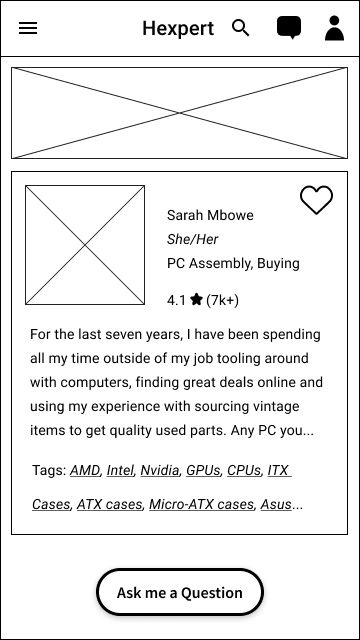

Updated designs include the expert’s availability and sections for education and experience on the expert’s page. The question modal became its own separate page to maintain focus and highlight the next step in the journey.


Payment
Participants were frustrated when they could not see the cost of the call they were booking, as rates were not shown during the scheduling process. Also, they did not like a payment gateway right before their call, as it could result in being late if there were payment issues.
Some participants were concerned that by allowing users to schedule a call of any length at various times, which could interfere with other calls unnecessarily.


Updated screens include payment information during the scheduling flow, and, instead of before the call, payment is taken during the scheduling process. Users can also ask to extend their call and pay within the video call, if the expert agrees and it does not overlap with subsequent calls.
Updated schedule flows have minimum and maximum time constraints for video calls, and also account for other confirmed calls.


Design Language System
Colour Palette
While this app is mostly aimed at a gamer audience, the aesthetics often used by gaming brands in the space reflect a quite aggressive style and dark colour palette. Instead, I decided to create a lighter, retro feel, using a bright inquisitive orange and dark chocolate browns to bring a warm, comfortable and confident tone. I felt this would also inspire trust in the experts.

Cards
The largest elements are the image and name, connecting the user with the expert. This emphasises the most important information in an intuitive way, as the user can see the experts face.
Highlighting the experts name and image personalises them to the user, drawing them in, and then the user will look at the expert’s cost, tags and rating to determine their attractiveness under their own preference. The bio gives a short taste, so as to not clutter up the cards with long descriptions, and trails off to encourage users to click on to their page and read further.

Questions
A simple first step to encourage users to clearly establish their problem regardless of their literacy with computer building language.
In testing, with card sorts and usability testing, the biggest hurdle was using the correct language so that, regardless of proficiency, anyone could navigate the website and find the appropriate knowledge. Giving users a subject category to choose related to their issue, and to add tags to their question, would allow users to give the experts more information up front and speed up conversion times.

Final Mock Ups, Prototypes & Deliverables
The deliverables for this project consisted of final mock-ups (wireframes & prototypes) with polished UI designs, and relevant design documentation (such as a design language system, task analysis and user flows).
This was my first UI design project, so I kept it simple. While this app is aimed squarely at a gamer audience, the aesthetics often used by gaming brands in the space reflect a quite aggressive style and usually darker colour palette. Instead, I decided to create a lighter, retro feel, using a bright inquisitive orange and dark chocolate browns to bring a warm, comfortable and confident atmosphere.


The voice of Hexpert itself is illustrated by our robot mascot, acting as the face of the app as an assistant who can help arrange your calls and provide assistance with any questions you have.


Conclusions
I believe that I fulfilled the basic criteria for success with this project. This app allows users to contact experts in computer building quickly, while giving users the information needed to build trust with an expert.
As my first design project, I am pretty proud of it!
With hindsight, I could do it all now in half the time. As it was part of a bootcamp, I was learning many techniques and skills that weren’t specifically useful in this project but could be in the future, and (as I’ll show in another project) I was planning my wedding, moving house and working. This was a big lesson in not taking on too many projects!
The Homepage
While the landing page serves its purpose, I did not design a separate homepage that is personalised to existing users, recommending experts or articles related to their searches or tagged interests. Personalising the homepage would help users find experts and articles, as well as get more eyes on experts’ profiles.
Messaging
Early on I wanted the message feature to have a chatbot that could read commands and allow the user to control their experience directly from messages, such as setting up calls, confirming payments, finding articles, and asking simple questions. While some parts still remain, I realised that I would need more research into this area in order to implement it for this service. Developing a proper chatbot feature would be an important next step for this project.
Animations & Illustrations
When creating a design language system and finalising my designs, my initial ideas involved more animations and illustrations, as well as incorporating the robot helper, and another robot, into the features of the app more regularly. As I was finishing the app it became clear that developing these aspects would take more time and testing than was reasonably available. I generally focused my time on the UX interactions over UI designs, so although the app’s visuals are functional, they feel slightly plain.
Next steps would be to redesign animations and transitions for the core user flows, and incorporate the robots into main features.
The Experts
While I did consider experts in design choices, such as methods of payment, and chat and article resources, which encourage users to pay experts consistently and ask important questions which don’t waste experts time, I did not research and create a persona for experts. At first I was focused on the user who consumes the content, but the user who provides content, the expert, deserved equal importance as without them there is no content.
Next steps would be to conduct another round of user interviews focusing on experts, then use that data to plot out user personas, user journeys and design a section for experts to edit their profile, see analytics and find supplementary material to help them thrive.